When Art Makes the Office More Human
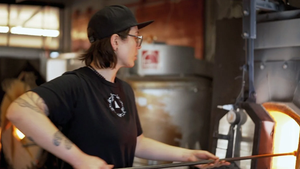
How do you create a workplace that doesn't just function — but also feels? That question served as a quiet undercurrent throughout the entire project when Sunny Tirunagaru at Attraktion worked with the spaces for Medovia. A business where warehouse and office meet, where efficiency is essential — but where people need to feel well within the functional.
In environments like these, much is already decided. Flows, hygiene requirements, logistics. That doesn't always leave room for the emotional. And yet that's precisely where it's needed most. Because when everything around us is optimised for performance, what's missing is often what makes us feel good.
That was the space in which Funkylicious found its role.
When Sunny first encountered the works, something in their directness immediately caught his attention. Not as an abstract idea, but as a concrete possibility. Funkylicious was clear, physical, hard to ignore. "It's visible. It takes up space. And in a work environment, that's sometimes exactly what's needed," as he himself describes it. Where other artworks might become quiet or difficult to connect with, Funkylicious functions more like an anchor in the room — something that draws the eye and holds it.
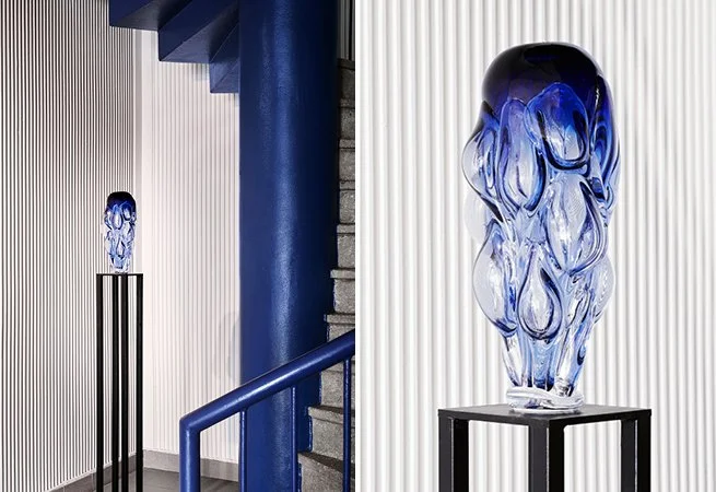
"Its upward-reaching character establishes a clear direction through the building, while its proportions — a narrow base carrying a heavier volume — introduce a subtle tension."
But it's not just a visual device. It's a deliberate balance.
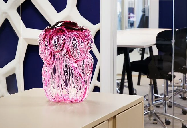
Medovia's environment carries a strong blue identity — tied to the brand, to the technical, to the rational. That kind of blue tone builds trust while simultaneously creating a certain distance from the human. Here, the first Funkylicious was introduced in pink, almost as a counter-movement. The pink form brings something organic, soft, almost bodily. Shapes that evoke cells, growth, life. It creates a different temperature in the room — a sense of care and openness.
"The pink form relates to the blue, but with a softer and more enveloping character. Together they create a dialogue in the room, where variation within a shared expression gives rise to balance rather than contrast."
At the same time, there is the second work — the blue Funkylicious in the lobby. Here, the colour is not a contrast but an amplification. The blue asserts itself as something more powerful, more defined. Almost like a manifestation of structure, precision and identity. Together, the two works form a clear tension: the feminine and the masculine, the soft and the strict, the organic and the technical. Not as opposites, but as things that need to coexist for an environment to feel whole.
It is in that balance that something happens.
Because art doesn't only affect how a room looks — but how it is used. Sunny describes how the presence of a glass work in the lobby changes the behaviour of people moving through it. The pace slows slightly. Movements become more considered. An intuitive respect for the space emerges. Through feeling.
And perhaps even more importantly — it gives the eye somewhere to rest.
In a day filled with screens, logistics and decisions, that small moment of stillness becomes unexpectedly meaningful. To be able to pause at something that asks nothing in return. Something that simply exists, and that allows feeling rather than performance. "Without the works, it could have felt like a warehouse. Now there's something else. Something human."
This is also where art becomes part of something larger than interior design. For Medovia, it's not just about how the spaces look, but about what they signal to the people who work there every day. That someone has thought it through. That the environment has been carefully shaped. That there is an intention beyond the functional. As part of employer branding.
In the end, perhaps that is precisely the point.
To create workplaces where people don't just function — but actually feel included, seen, and a little more at ease. Where there is room for both structure and softness. For both efficiency and presence.
And sometimes it takes just two objects in glass. One pink. One blue. To begin transforming the entire experience of a place.
Jo Andersson Studios
info@joanderssonstudios.com